Are you looking for a jQuery solution to develop a datepicker with range selection? well, this tutorial explains how to create a datepicker with a custom date range selection using jQuery UI datepicker. For this purpose, we’ll use a lightweight jQuery datepicker plugin that will extend the date range selection feature to the default jQuery UI datepicker.
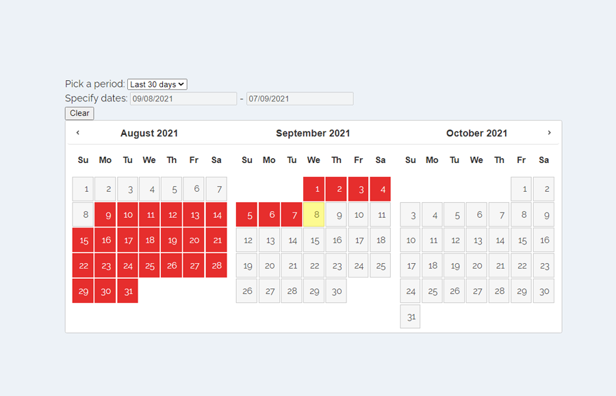
The plugin allows to select date range up to three months in a single view of datepicker. Similarly, users can enter the custom date range inside the input. Besides this, users can easily pick a range using the dropdown selection for the last 7 days, and the last 30 days, etc. For a better user experience, a clear button is also available to quickly deselect dates in case of wrong selection.
You can check all these features on the demo page to test the datepicker. There you can see a basic user interface for date range selection and a jQuery UI based date picker calendar. The layout and design can be highly customized with additional CSS in order to fit the date picker in your project.
How to Create jQuery Datepicker with Range Selection
First of all, load jQuery, UI framework, Moment JS, and date picker JavaScript file into the head tag of your HTML document.
<!-- jQuery -->
<script src='https://cdnjs.cloudflare.com/ajax/libs/jquery/3.1.1/jquery.min.js'></script>
<!-- jQuery UI CSS -->
<link rel='stylesheet' href='https://code.jquery.com/ui/1.12.1/themes/base/jquery-ui.css'>
<!-- jQuery UI -->
<script src='https://cdnjs.cloudflare.com/ajax/libs/jqueryui/1.12.1/jquery-ui.min.js'></script>
<!-- Moment JS -->
<script src='https://momentjs.com/downloads/moment.min.js'></script>
<!-- Date Picker JS -->
<script  src="js/date-picker.js"></script>
After that, create a div element with a class name "dates" and place two sections "date-settings" and "dates--pickers" inside it. Create a select element with an id “period” and place date range options inside it. Like, you can place an option for the custom date range, last seven days, and last thirty days, etc.
Inside the second section, you just need to create a div element with a unique id "datepicker" in which the date picker will be rendered. So, the complete HTML structure for a date picker with range selection is as follows:
<div class="dates">
  <div class="dates--settings">
    <div class="dates--settings--section">
      Pick a period:
      <select id="period">
        <option value="custom">Custom</option>
        <option value="last7">Last 7 days</option>
        <option value="last30">Last 30 days</option>
      </select>
    </div>
    <div class="dates--settings--section">
       Specify dates:
      <input type="text" id="start_date" />
      -
      <input type="text" id="end_date" />
    </div>
    <div class="dates--settings--section">
      <button id="clear">Clear</button>
    </div>
  </div>
      <div class="dates--pickers">
    <div id="datepicker"></div>
  </div>
</div>
Place the above HTML where you want to integrate the date picker in your project. You can also wrap the code in further elements in order to customize it according to your needs.
Style the Date Picker
Basically, the date picker comes with default styles based on jQuery UI CSS. Anyhow, you can customize the datepicker layout and selected dates by defining the custom values for the CSS classes. To do so, select the "dates" class (that is the main container of date range and calendar) and display it as flex. Define its 100% width and flex-direction as a column.
.dates {
  display: flex;
  flex-direction: column;
  width: 100%;
  margin: 0 auto;
}
Similarly, select the "dates--pickers" and "ui-state-default" classes and define flex-shrink, flex-grow, background, color, and box-shadow as follows:
.dates--pickers {
  flex-shrink: 1;
  flex-grow: 1;
}

.dates--settings {
  flex-shrink: 0;
  flex-grow: 0;
}

.ui-state-default.ui-state-active {
  background: #f6f6f6;
  color: #454545;
}

.active.ui-datepicker-today .ui-state-default {
  box-shadow: inset 0 0 8px 2px red;
  background: yellow;
  color: black;
}
In order to highlight the selected dates, target the ".active > a.ui-state-default.ui-state-active" class and define CSS styles for it. You can set the background color, border, and color values as described below.
.active > a.ui-state-default,
.active > a.ui-state-default.ui-state-active {
  background: red;
  border: 1px solid red;
  color: #fff;
}
The following are all available classes to customize the datepicker layout and design. You can override the existing styles by defining additional CSS for these classes.
.ui-widget-header {
  background: transparent;
  border-width: 0 0 1px 0;
}

.ui-widget-header .ui-state-hover {
  border: transparent;
}

.ui-datepicker .ui-datepicker-prev-hover, .ui-datepicker .ui-datepicker-next-hover {
  top: 2px;
}

.ui-datepicker .ui-datepicker-prev-hover {
  left: 2px;
}

.ui-datepicker .ui-datepicker-next-hover {
  right: 2px;
}

.ui-datepicker .ui-datepicker-prev span {
  background-position: -96px 0;
}

.ui-datepicker .ui-datepicker-next span {
  background-position: -32px 0;
}

.ui-datepicker th {
  padding: 1em 0;
  background: transparent;
}

.ui-datepicker td .ui-state-default {
  padding: 0.5em;
}
That’s all! I hope you have successfully created datepicker with range selection with the help of jQuery UI datepicker. If you have any questions or suggestions let me know by comment below.