Looking for a clean coded progress bar? This is a CSS progress bar with percentage value which easies to customize. All you need to change the value in HTML and you are done.
Just a few lines of CSS code required to build it. It’s responsive and works on mobile too. It is a basic skill bar without having any animations but you can implement animation on progress bar by using CSS3 keyframe properties.
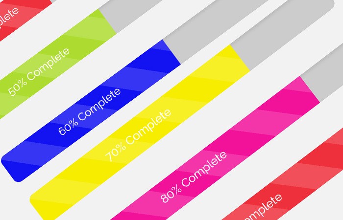
It displays a percentage of progress of skils out of 100. If you want to achieve fast loading speed on your site which is an important factor nowdays —- This progress bar is a better option for this purpose.
The aim of making this progress bar to keep the code as minimal as possible.
How to Create a Percentage CSS Progress Bar
Only a file require to add is style.css which you can find in a downloadable source to get started with making CSS progress bar.
<link rel="stylesheet" type="text/css" href="style.css" />
There are only three things driving these progress bars are an outer container element with the .progress class and an inner element with .progress-barclass and inline style style="width: __%" where the “__” signifies a number under 100.
The third thing is a <span> tag containing the optional text. The default background color will be orange by default.
<div class="progress progress-striped">
  <div class="progress-bar" style="width: 40%">
    <span>40% Complete </span>
  </div>
</div>
Percentage
The percentage value can easily change by changing the width inline style of the .progress-bar class div.
<div class="progress progress-striped">
  <div class="progress-bar progress-bar-green" style="width: 50%">
    <span>50% Complete </span>
  </div>
</div>
Color
You can add the additional class .progress-bar-blue to any progress bar to make it in a different color.
<div class="progress progress-striped">
  <div class="progress-bar progress-bar-blue" style="width: 60%">
    <span>60% Complete </span>
  </div>
</div>