If you want to extend Bootstrap’s primary navigation functionality then you need an extra plugin. Here we will share Bootstrap Mega Menu with a Submenu that helps you make Bootstrap 5 responsive mega menu. Moreover, you can add a multilevel dropdown Menu with a search box. This mega navigation builds with the Bootstrap 5 menu component. You can implement this mega submenu into the existing bootstrap nav component.
By using this easy-to-use Mega menu plugin you can easily create multiple levels of dropdowns. Additionally, you can add different elements to the mega menu such as you can place cards, links, paragraphs, photos, and more. You can also add the elements like forms, accordions, tabs, images, and more. The toggle nav is also added to the menu that works in mobile view. The hamburger button included nice and clean animation that enhance the user experience.
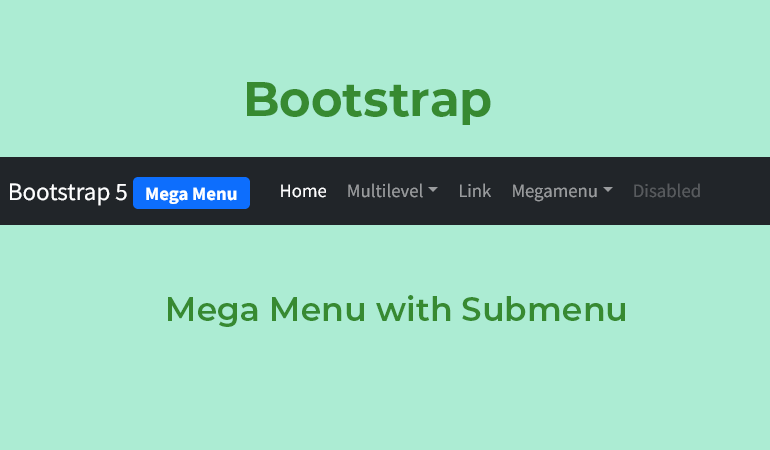
Build Responsive Bootstrap Mega Menu with Submenu
This mega menu doesn’t require Javascript because its works with Bootstrap 5 that use native dropdown navbar components. There is no need to add extra style to make it look good because it comes with a pretty awesome design and style. There is only a little Js function required which will toggle hamburgers on mobile or tablet screens.
To add the bootstrap mega menu into the document you need to load the Bootstrap 5 CSS file, Font awesome icon, Google fonts, and optional style CSS file into the head tag of the webpage.
<!-- Bootstrap 5 CSS -->
<link rel='stylesheet' href='https://cdn.jsdelivr.net/npm/bootstrap@5.0.2/dist/css/bootstrap.min.css'>
<!-- Font Awesome CSS -->
<link rel='stylesheet' href='https://cdnjs.cloudflare.com/ajax/libs/font-awesome/5.11.2/css/all.min.css'>
<!-- Google Fonts -->
<link rel='stylesheet' href='https://fonts.googleapis.com/css2?family=Source+Sans+Pro:wght@400;700&display=swap'>
<!-- Additional CSS (Optional) -->
<link rel="stylesheet" href="css/style.css">
Mega Menu HTML Example
Let’s start building the HTML structure for our mega menu. We will use the navigation menu HTML component Bootstrap.
<nav class="navbar navbar-expand-lg navbar-light bg-dark navbar-dark shadow">
    <div class="container-fluid">
      <a class="navbar-brand" href="#">Bootstrap 5 <span class="badge bg-primary">Mega Menu</span></a>
      <button class="navbar-toggler collapsed" type="button" data-bs-toggle="collapse" data-bs-target="#navbar-content">
        <div class="hamburger-toggle">
          <div class="hamburger">
            <span></span>
            <span></span>
            <span></span>
          </div>
        </div>
      </button>
      <div class="collapse navbar-collapse" id="navbar-content">
        <ul class="navbar-nav mr-auto mb-2 mb-lg-0">
          <li class="nav-item">
            <a class="nav-link active" aria-current="page" href="#">Home</a>
          </li>
          <li class="nav-item dropdown">
            <a class="nav-link dropdown-toggle" href="#" data-bs-toggle="dropdown" data-bs-auto-close="outside">Multilevel</a>
            <ul class="dropdown-menu shadow">
              <li><a class="dropdown-item" href="#">Gallery</a></li>
              <li><a class="dropdown-item" href="blog.html">Blog</a></li>
              <li class="dropstart">
                <a href="#" class="dropdown-item dropdown-toggle" data-bs-toggle="dropdown">Submenu Left</a>
                <ul class="dropdown-menu shadow">
                  <li><a class="dropdown-item" href=""> Third level 1</a></li>
                  <li><a class="dropdown-item" href=""> Third level 2</a></li>
                  <li><a class="dropdown-item" href=""> Third level 3</a></li>
                  <li><a class="dropdown-item" href=""> Third level 4</a></li>
                  <li><a class="dropdown-item" href=""> Third level 5</a></li>
                </ul>
              </li>
              <li class="dropend">
                <a href="#" class="dropdown-item dropdown-toggle" data-bs-toggle="dropdown" data-bs-auto-close="outside">Submenu Right</a>
                <ul class="dropdown-menu shadow">
                  <li><a class="dropdown-item" href=""> Second level 1</a></li>
                  <li><a class="dropdown-item" href=""> Second level 2</a></li>
                  <li><a class="dropdown-item" href=""> Second level 3</a></li>
                  <li class="dropend">
                    <a href="#" class="dropdown-item dropdown-toggle" data-bs-toggle="dropdown">Let's go deeper!</a>
                    <ul class="dropdown-menu dropdown-submenu shadow">
                      <li><a class="dropdown-item" href=""> Third level 1</a></li>
                      <li><a class="dropdown-item" href=""> Third level 2</a></li>
                      <li><a class="dropdown-item" href=""> Third level 3</a></li>
                      <li><a class="dropdown-item" href=""> Third level 4</a></li>
                      <li><a class="dropdown-item" href=""> Third level 5</a></li>
                    </ul>
                  </li>
                  <li><a class="dropdown-item" href=""> Third level 5</a></li>
                </ul>
              </li>
              <li><hr class="dropdown-divider"></li>
              <li><a class="dropdown-item" href="#">Something else here</a></li>
            </ul>
          </li>
          <li class="nav-item">
            <a class="nav-link" href="#">Link</a>
          </li>
          <li class="nav-item dropdown dropdown-mega position-static">
            <a class="nav-link dropdown-toggle" href="#" data-bs-toggle="dropdown" data-bs-auto-close="outside">Megamenu</a>
            <div class="dropdown-menu shadow">
              <div class="mega-content px-4">
                <div class="container-fluid">
                  <div class="row">
                    <div class="col-12 col-sm-4 col-md-3 py-4">
                      <h5>Title</h5>
                      <div class="list-group">
                        <a class="list-group-item" href="#">Mega Menu Link</a>
                        <a class="list-group-item" href="#">Mega Menu Link</a>
                        <a class="list-group-item" href="#">Mega Menu Link</a>
                      </div>
                    </div>
                    <div class="col-12 col-sm-4 col-md-3 py-4">
                      <h5>Card Title</h5>
                      <div class="card">
                  <img src="img/banner-image.jpg" class="img-fluid" alt="image">
                  <div class="card-body">
                    <p class="card-text">Description goes here...</p>
                  </div>
                </div>
                    </div>
                    <div class="col-12 col-sm-4 col-md-3 py-4">
                      <h5>Title</h5>
                        <p>Description goes here...</p>
                    </div>
                    <div class="col-12 col-sm-12 col-md-3 py-4">
                      <h5>Title</h5>
                      <div class="list-group">
                        <a class="list-group-item" href="#">Menu Link</a>
                        <a class="list-group-item" href="#">Menu Link</a>
                        <a class="list-group-item" href="#">Menu Link</a>
                      </div>
                    </div>
                  </div>
                </div>
              </div>
            </div>
          </li>
          <li class="nav-item">
            <a class="nav-link disabled" href="#" tabindex="-1" aria-disabled="true">Disabled</a>
          </li>
        </ul>
        <form class="d-flex ms-auto">
            <div class="input-group">
                <input class="form-control border-0 mr-2" type="search" placeholder="Search" aria-label="Search">
                <button class="btn btn-primary border-0" type="submit">Search</button>
            </div>
        </form>
      </div>
    </div>
  </nav>
Loading Bootstrap Javascript
After creating the HTML, we need to load the Bootstrap 5 Js file through the CDN link. You can put the CDN links before closing the body tag.
<!-- Bootstrap 5 JS -->
<script src='https://cdn.jsdelivr.net/npm/bootstrap@5.0.2/dist/js/bootstrap.bundle.min.js'></script>
To make work the hamburger button on mobile we need to initialize the JS function by adding the following code.
document.addEventListener('click',function(e){
// Hamburger menu
if(e.target.classList.contains('hamburger-toggle')){
    e.target.children[0].classList.toggle('active');
  }
})
Conclusion
Did you implement this Bootstrap 5 responsive mega menu with multilevel into your project page? Let me know what it looks like. You can customize the style by editing the CSS file. If have any issues you can let me know in the below comment.