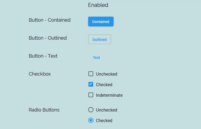
The Matter.css is a complete library of material components which build with Pure CSS only. It’s a readymade kit which easies to use.
It includes a lot of items and all you need to pick a specific component and its CSS to implement on your website.
You just need to pick the HTML code and one class from the stylesheet and you are done.
All of the components are design for modern web and mobile sites.
What are Components Included in Matter.css?
The library included more than 10 components. It has all the basic components which every website should need. Let’s take a look at the list of components.
- Three Different Buttons
- Two Different Checkbox
- Two Radio buttons
- Toggle switch
- Range slider
- Progress – Circular
- Progress – Linear
- Text field
- Tooltip
- And more…
How to Use Material Components:
Download the component and add the Matter.css on the web page.
<link rel="stylesheet" type="text/css" href="dist/matter.css" />
Each component arrange in a different folder for easy to use. Simple Go to src/components and you will find the different folders for each component.
Now Let’s take a look at the HTML of Different Buttons.
<!-- Button Markup; Classes: matter-button-contained, matter-button-outlined, matter-button-text, -->
<!-- matter-button-unelevated -->
<button class="matter-button-contained">BUTTON</button>
<!-- Button Examples: Contained, Outlined, Text and Unelevated Buttons -->
<button class="matter-button-contained">CONTAINED</button>
<button class="matter-button-outlined">OUTLINED</button>
<button class="matter-button-text">TEXT</button>
<button class="matter-button-unelevated">UNELEVATED</button>
It’s quite easy to change the color of any component, All you need to add define a specified class name.
<!-- Change the color of components -->
<!-- Classes: matter-primary, matter-secondary, matter-error, matter-warning, matter-success -->
<button class="matter-button-contained matter-secondary">BUTTON</button>
<!-- Change the color of text; Classes: matter-primary-text, matter-secondary-text, -->
<!-- matter-error-text, matter-warning-text, matter-success-text -->
<p class="matter-secondary-text">I am a paragraph</p>
Who Need this Kit?
Its design for people who work on:
- Building Simple projects
- Internal facing tools.
- Framework-less apps.
- Javascript-less apps.
- Proof of Concept and demo projects.
Changelog:
v0.2.0 (03/27/2019)
- Add Different color scheme (Primary, Secondary, Error, Warning, Success).
- Add Link styling.
- Add Typography (H1 – H6, overline, subtitles, and more).
- Add: Unelevated Button (shadowless Contained Button).
- Change: Buttons – Remove forced uppercase (96c9a5c).
- Change: Components – Introduce intermediate CSS variables for theme colors (1cb7650).
- Change: Switch – Use surface color as off-color of thumb.
