Do you want to create Facebook content placeholder? In this tutorial, I will show you how you can create a loading animation facebook style with CSS only.
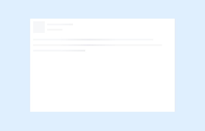
You have noticed such animation on Facebook while scrolling down. Before it loads the acutally post, It load placeholder elements for image and text.
This effect also called Facebook’s new post loader which looks awesome and provider great user experience for the site visitor.
It’s now very old style because was introduced in 2014 on facebook but if you want to implement lazying loading then this tutorial will surely help you.
It’s quite easy to create such loading animation with the help of CSS and HTML. You don’t need to implement Javascript.
How to Create Placeholder Animation while Loading Like Facebook
If you don’t want to go through each style from the CSS than simply add the following CSS in your HTML document.
<link rel="stylesheet" href="css/style.css">
After adding the style.css now we will take a look markup. As you see we have the main div with class name post. Next, we have an inner div with class panel-effect which provide animation.
Finally, we will add multiple divs to show different lines with animations.
<div class='post'>
  <div class='panel-effect'>
    <div class='fake-effect fe-0'></div>
    <div class='fake-effect fe-1'></div>
    <div class='fake-effect fe-2'></div>
    <div class='fake-effect fe-3'></div>
    <div class='fake-effect fe-4'></div>
    <div class='fake-effect fe-5'></div>
    <div class='fake-effect fe-6'></div>
    <div class='fake-effect fe-7'></div>
    <div class='fake-effect fe-8'></div>
    <div class='fake-effect fe-9'></div>
    <div class='fake-effect fe-10'></div>
    <div class='fake-effect fe-11'></div>
  </div>
</div>
The CSS
Let’s start with styling and first we will do add some general style for the main container (post). We will create a box with a white background and give some width and height.
.post {
  -moz-box-sizing: border-box;
  -webkit-box-sizing: border-box;
  box-sizing: border-box;
  width: 496px;
  height: 326px;
  padding: 10px;
  margin: 10px auto;
  -moz-border-radius: 3px;
  -webkit-border-radius: 3px;
  border-radius: 3px;
  background-color: #fff;
  border: 1px solid;
  border-color: #e5e6e9 #dfe0e4 #d0d1d5;
}
Adding Fancy Animated Background
Here is actually magic happens. We will animate the background and we wil use the CSS gradient for its background.
.panel-effect {
  position: relative;
  background: #f6f7f8 no-repeat 800px 104px;
  background-image: url('data:image/svg+xml;base64,PD94bWwgdmVyc2lvbj0iMS4wIiBlbmNvZGluZz0idXRmLTgiPz4gPHN2ZyB2ZXJzaW9uPSIxLjEiIHhtbG5zPSJodHRwOi8vd3d3LnczLm9yZy8yMDAwL3N2ZyI+PGRlZnM+PGxpbmVhckdyYWRpZW50IGlkPSJncmFkIiBncmFkaWVudFVuaXRzPSJvYmplY3RCb3VuZGluZ0JveCIgeDE9IjAuMCIgeTE9IjAuNSIgeDI9IjEuMCIgeTI9IjAuNSI+PHN0b3Agb2Zmc2V0PSIwJSIgc3RvcC1jb2xvcj0iI2Y2ZjdmOCIvPjxzdG9wIG9mZnNldD0iMjAlIiBzdG9wLWNvbG9yPSIjZWRlZWYxIi8+PHN0b3Agb2Zmc2V0PSI0MCUiIHN0b3AtY29sb3I9IiNmNmY3ZjgiLz48c3RvcCBvZmZzZXQ9IjEwMCUiIHN0b3AtY29sb3I9IiNmNmY3ZjgiLz48L2xpbmVhckdyYWRpZW50PjwvZGVmcz48cmVjdCB4PSIwIiB5PSIwIiB3aWR0aD0iMTAwJSIgaGVpZ2h0PSIxMDAlIiBmaWxsPSJ1cmwoI2dyYWQpIiAvPjwvc3ZnPiA=');
  background-size: 100%;
  background-image: -webkit-gradient(linear, 0% 50%, 100% 50%, color-stop(0%, #f6f7f8), color-stop(20%, #edeef1), color-stop(40%, #f6f7f8), color-stop(100%, #f6f7f8));
  background-image: -moz-linear-gradient(left, #f6f7f8 0%, #edeef1 20%, #f6f7f8 40%, #f6f7f8 100%);
  background-image: -webkit-linear-gradient(left, #f6f7f8 0%, #edeef1 20%, #f6f7f8 40%, #f6f7f8 100%);
  background-image: linear-gradient(to right, #f6f7f8 0%, #edeef1 20%, #f6f7f8 40%, #f6f7f8 100%);
  height: 104px;
  -moz-animation: anim 1s forwards infinite linear;
  -webkit-animation: anim 1s forwards infinite linear;
  animation: anim 1s forwards infinite linear;
}
We will apply the style to each line elements as following
.fake-effect {
  position: absolute;
  background: #fff;
  right: 0;
  left: 0;
  height: 6px;
}
.fe-0 {
  height: 40px;
  left: 40px;
  width: 8px;
}
.fe-1 {
  height: 8px;
  left: 48px;
  top: 0;
  right: 0;
}
.fe-2 {
  left: 136px;
  top: 8px;
}
.fe-3 {
  height: 12px;
  left: 48px;
  top: 14px;
}
.fe-4 {
  left: 100px;
  top: 26px;
}
.fe-5 {
  height: 10px;
  left: 48px;
  top: 32px;
}
.fe-6 {
  height: 20px;
  top: 40px;
}
.fe-7 {
  left: 410px;
  top: 60px;
}
.fe-8 {
  height: 13px;
  top: 66px;
}
.fe-9 {
  left: 440px;
  top: 79px;
}
.fe-10 {
  height: 13px;
  top: 85px;
}
.fe-11 {
  left: 178px;
  top: 98px;
}
A keyframe is the best way to apply animation to elements and it’s easy too.
@keyframes anim {
  0% {
    background-position: -468px 0;
  }
  100% {
    background-position: 468px 0;
  }
}
@-o-keyframes anim {
  0% {
    background-position: -468px 0;
  }
  100% {
    background-position: 468px 0;
  }
}
@-ms-keyframes anim {
  0% {
    background-position: -468px 0;
  }
  100% {
    background-position: 468px 0;
  }
}
@-moz-keyframes anim {
  0% {
    background-position: -468px 0;
  }
  100% {
    background-position: 468px 0;
  }
}
@-webkit-keyframes anim {
  0% {
    background-position: -468px 0;
  }
  100% {
    background-position: 468px 0;
  }
}
That’s It. Our demo is ready to take a look.