The Off-Canvas Hamburger Menu is a new addition in web design. Before it was only for mobile but now the latest web trend shows many sites add them on the desktop version of the site.
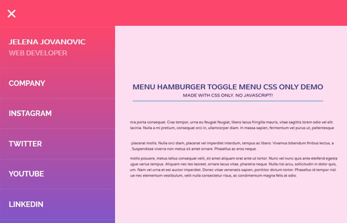
Today, We have a fancy hamburger toggle navigation Menu which builds with CSS/CSS3 only. It allows the user to toggle an off-canvas side menu by clicking on the hamburger toggle button in the header.
It is responsive and mobile friendly. It also colors full and which access from the right side of the page. I am sure, You will love this new addition in our tutorials series.
You may be thinking about implementation, To be honest, It’s dead easy to add on any kind of website whether you have a dynamic or static website.
How to use Hamburger Menu:
We are not going to use any kind of images or Icons fonts to create the header toggle button. But will manage it through CSS only.
Let’s start with the header and We added a div with a class header
<div class="header"></div>
Next is about toggle button and for this, I will create a checkbox to handle the click function.
<input type="checkbox" class="openSidebarMenu" id="openSidebarMenu">
We will hide the checkbox though CSS and create a hamburger Icon using Label and add three divs inside the label element.
<label for="openSidebarMenu" class="sidebarIconToggle">
    <div class="spinner diagonal part-1"></div>
    <div class="spinner horizontal"></div>
    <div class="spinner diagonal part-2"></div>
</label>
That’s it with the header and button. Now we will create a sidebar menu which will open when clicking on the button.
<div id="sidebarMenu">
<ul class="sidebarMenuInner">
  <li>Jelena Jovanovic <span>Web Developer</span></li>
  <li><a href="#">Company</a></li>
  <li><a href="#">Instagram</a></li>
  <li><a href="#">Twitter</a></li>
  <li><a href="#">YouTube</a></li>
  <li><a href="#">Linkedin</a></li>
</ul>
</div>
The CSS
Now it’s time to style the HTML to make it beautiful. We will do add some general style for page, body, and header.
html, body {
    overflow-x: hidden;
    height: 100%;
}
body {
    background: #fff;
    padding: 0;
    margin: 0;
    font-family: 'Varela Round', sans-serif;
}
.header {
    display: block;
    margin: 0 auto;
    width: 100%;
    max-width: 100%;
    box-shadow: none;
    background-color: #FC466B;
    position: fixed;
    height: 60px!important;
    overflow: hidden;
    z-index: 10;
}
.main {
    margin: 0 auto;
    display: block;
    height: 100%;
    margin-top: 60px;
}
.mainInner{
    display: table;
    height: 100%;
    width: 100%;
    text-align: center;
}
.mainInner div{
    display:table-cell;
    vertical-align: middle;
    font-size: 3em;
    font-weight: bold;
    letter-spacing: 1.25px;
}
Next, We will style the sidebar menu. We will add some nice background color and style links with color and border.
#sidebarMenu {
    height: 100%;
    position: fixed;
    left: 0;
    width: 250px;
    margin-top: 60px;
    transform: translateX(-250px);
    transition: transform 250ms ease-in-out;
    background: linear-gradient(180deg, #FC466B 0%, #3F5EFB 100%);
	z-index:999;
}
.sidebarMenuInner{
    margin:0;
    padding:0;
    border-top: 1px solid rgba(255, 255, 255, 0.10);
}
.sidebarMenuInner li{
    list-style: none;
    color: #fff;
    text-transform: uppercase;
    font-weight: bold;
    padding: 20px;
    cursor: pointer;
    border-bottom: 1px solid rgba(255, 255, 255, 0.10);
}
.sidebarMenuInner li span{
    display: block;
    font-size: 14px;
    color: rgba(255, 255, 255, 0.50);
}
.sidebarMenuInner li a{
    color: #fff;
    text-transform: uppercase;
    font-weight: bold;
    cursor: pointer;
    text-decoration: none;
}
As I said, I will create the Hamburger button with CSS so you don’t need to add extra font or image.
input[type="checkbox"]:checked ~ #sidebarMenu {
    transform: translateX(0);
}

input[type=checkbox] {
    transition: all 0.3s;
    box-sizing: border-box;
    display: none;
}
.sidebarIconToggle {
    transition: all 0.3s;
    box-sizing: border-box;
    cursor: pointer;
    position: absolute;
    z-index: 99;
    height: 100%;
    width: 100%;
    top: 22px;
    left: 15px;
    height: 22px;
    width: 22px;
}
.spinner {
    transition: all 0.3s;
    box-sizing: border-box;
    position: absolute;
    height: 3px;
    width: 100%;
    background-color: #fff;
}
.horizontal {
    transition: all 0.3s;
    box-sizing: border-box;
    position: relative;
    float: left;
    margin-top: 3px;
}
.diagonal.part-1 {
    position: relative;
    transition: all 0.3s;
    box-sizing: border-box;
    float: left;
}
.diagonal.part-2 {
    transition: all 0.3s;
    box-sizing: border-box;
    position: relative;
    float: left;
    margin-top: 3px;
}
input[type=checkbox]:checked ~ .sidebarIconToggle > .horizontal {
    transition: all 0.3s;
    box-sizing: border-box;
    opacity: 0;
}
input[type=checkbox]:checked ~ .sidebarIconToggle > .diagonal.part-1 {
    transition: all 0.3s;
    box-sizing: border-box;
    transform: rotate(135deg);
    margin-top: 8px;
}
input[type=checkbox]:checked ~ .sidebarIconToggle > .diagonal.part-2 {
    transition: all 0.3s;
    box-sizing: border-box;
    transform: rotate(-135deg);
    margin-top: -9px;
}
And you are ready to use it. Nothing hard. Have a look at the demo and download the source with some extra dummy content placement.