If you are not aware, The off-canvas hamburger menus which build with the only CSS are not a recent discovery. You may know that Chris Coyier wrote about this technique back in November of 2012.
Today, We will walk through you to create another simple but Pure Hamburger Fold-out Menu which are responsive and work well with major browsers. We also include the example and downloadable file.
We can create such navigation with Javascript but Why CSS Only?
The answer is to achieve progressive enhancements and increase site load speed.
How to Create Hamburger Fold-out Menu with CSS
We will create it with minimal markup and also will not use any font Icon. Instead of, I will create an icon with HTML and CSS.
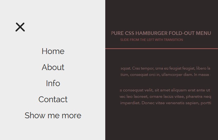
The menu will be accessible from the right side of the page by clicking on a three line button. We did a little experience with Hamburger Toggle Menu before but here we will design them differently.
Also will add a Fold-out animation to make it look good.
Let’s do this!
The HTML
We have a simple and standard HTML for this.
- Our parent <nav> element
- A child div
menuToggle - A Checkbox to handle Click Function
- Three Span Tags for Hamburger Lines
- The standard navigation in an <ul> element
<nav role="navigation">
  <div id="menuToggle">
    <input type="checkbox" />
    <span></span>
    <span></span>
    <span></span>
    <ul id="menu">
      <a href="#"><li>Home</li></a>
      <a href="#"><li>About</li></a>
      <a href="#"><li>Info</li></a>
      <a href="#"><li>Contact</li></a>
      <a href="#" target="_blank"><li>Show me more</li></a>
    </ul>
  </div>
</nav>
Let’s style!
Let’s do some basic styling which includes background color, font-family and a little transition for the link.
body
{
  margin: 0;
  padding: 0;
  background: #232323;
  color: #cdcdcd;
  font-family: "Avenir Next", "Avenir", sans-serif;
}
a
{
  text-decoration: none;
  color: #232323;
  transition: color 0.3s ease;
}
a:hover
{
  color: tomato;
}
Now Let’s style the layout of inner div (Child Div) and keep it on the left side by setting the position.
#menuToggle
{
  display: block;
  position: relative;
  top: 50px;
  left: 50px;
  z-index: 1;
  -webkit-user-select: none;
  user-select: none;
}

#menuToggle input
{
  display: block;
  width: 40px;
  height: 32px;
  position: absolute;
  top: -7px;
  left: -5px;
  cursor: pointer;
  opacity: 0; /* hide this */
  z-index: 2; /* and place it over the hamburger */
  -webkit-touch-callout: none;
}
Now Just create a quick hamburger button with CSS. With the help of background color and set the width/height, we can easily create it.
#menuToggle span
{
  display: block;
  width: 33px;
  height: 4px;
  margin-bottom: 5px;
  position: relative;
  background: #cdcdcd;
  border-radius: 3px;
  z-index: 1;
  transform-origin: 4px 0px;
  transition: transform 0.5s cubic-bezier(0.77,0.2,0.05,1.0),
              background 0.5s cubic-bezier(0.77,0.2,0.05,1.0),
              opacity 0.55s ease;
}

#menuToggle span:first-child
{
  transform-origin: 0% 0%;
}

#menuToggle span:nth-last-child(2)
{
  transform-origin: 0% 100%;
}
This little CSS help us to transform all the slices of hamburger
#menuToggle input:checked ~ span
{
  opacity: 1;
  transform: rotate(45deg) translate(-2px, -1px);
  background: #232323;
}
But Let’s hide the middle one so we can create a close cross (x) button
#menuToggle input:checked ~ span:nth-last-child(3)
{
  opacity: 0;
  transform: rotate(0deg) scale(0.2, 0.2);
}
Now move the late one to other direction.
#menuToggle input:checked ~ span:nth-last-child(2)
{
  transform: rotate(-45deg) translate(0, -1px);
}
Styling Menu
With this CSS, We can style our menu items.
#menu
{
  position: absolute;
  width: 300px;
  margin: -100px 0 0 -50px;
  padding: 50px;
  padding-top: 125px;
  background: #ededed;
  list-style-type: none;
  -webkit-font-smoothing: antialiased;
  transform-origin: 0% 0%;
  transform: translate(-100%, 0);
  transition: transform 0.5s cubic-bezier(0.77,0.2,0.05,1.0);
}

#menu li
{
  padding: 10px 0;
  font-size: 22px;
}
Finally, We will slide it in from the left which a button click.
#menuToggle input:checked ~ ul
{
  transform: none;
}
That’s It! Let’s implement on your website and customize it.